In this post I will describe two different ways to use color in a painting that have
special significance to me, since I tend to oscillate between the two.
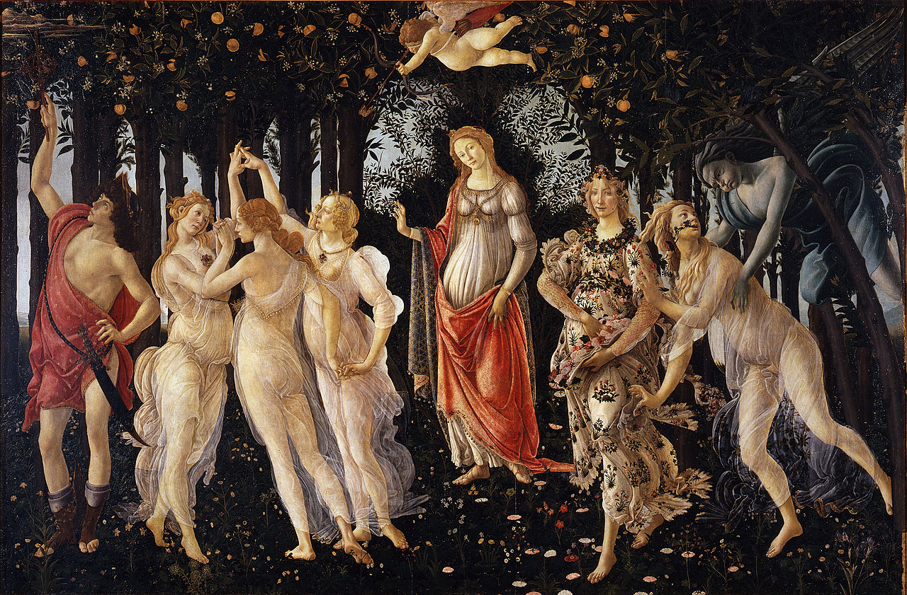
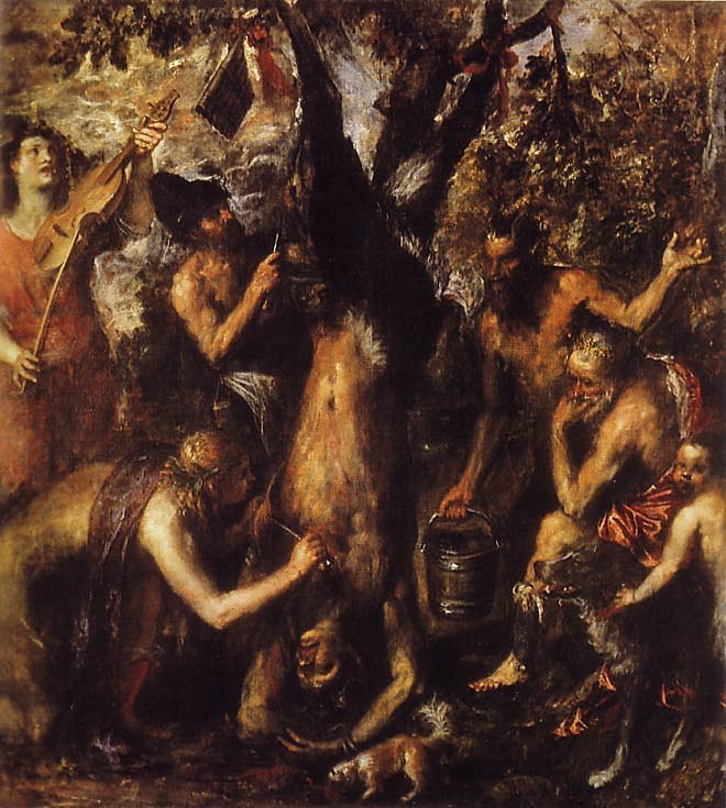
Roughly speaking, these two ways correspond to the Florentine school and the Venetian school. In the Florentine school local color predominates, ie, the color that the object itself has. On the other hand, in the Venetian school ambient light predominates, the color and quality of the light that bathes the scene.
In the first case, in the Florentine school, a white sheet of paper tends to be shown as white, even if it obviously has its light, half-tone and shadow areas. Actually, the painters of the Renaissance worked with 5 or even 7 different light areas to establish volume, but lets keep it simple. If I’m painting a red drapery, I mix colors for its light, halftone and shadow areas, and so on for all other objects. This results in a scene that is lit by a relatively uniform constant diffuse colorless light thoughout the whole scene. The result is an idealized scene in accordance to the anatomical idealization of Florentine painting. In fact, there are no people with such fine proportions and contours nor such even uniform lighting situations in nature.
In a current day painting that has, of course, very different aesthetic goals from renaissance painting, this method would correspond to choose a palette of pre-mixed colors in which have a few dominant colors and from these colors create some variations, particularly in value (how light or dark a color is). Then simply place the color in the areas one beside the other, with or without fusion of contours, basing the painting on the original “chord” of colors chosen. And do it finishing work on an area of the painting before doing another.
In the Venetian school, on the other hand, the idea is that the local color, the color that an object has, changes depending on the charcater and color of the general ambient light. In it, a white sheet of paper, under a light pinkish twilight environment, will not be painted white. It is a pinkish gray of a more or less darker shade depending on the intensity of the light falling on it in that part of the scene. Our brain compensates allowing us to recognize a white paper sheet under any lighting condition. This results in less idealization and clarity in individual objects, but the scene as a whole increases in emotional intensity and becomes much more convincing, with clearer areas of intense light.
In a current day painting this would imply using a midtone priming background color that matches the average paint tone , or at least a manner of painting that does not finish one area after the other but works the whole canvas simultaneously touching all areas . In this case, transparency of colors and fragmented brushstrokes become much more important. The contours tend to become more or less indistinct with lighting and distance and one or more light sources clearly apear on the scene.
Two different examples in my painting:

Mauricio Piza, São Vito e a Mó, Saint Vito and the Millstone, oil, 2012. Ambient Color.
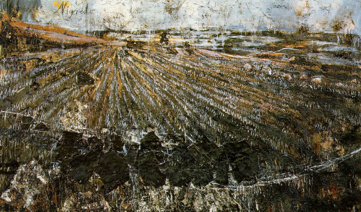
Juan Gris and Anselm Kiefer clearly use ambient light in these paintings.
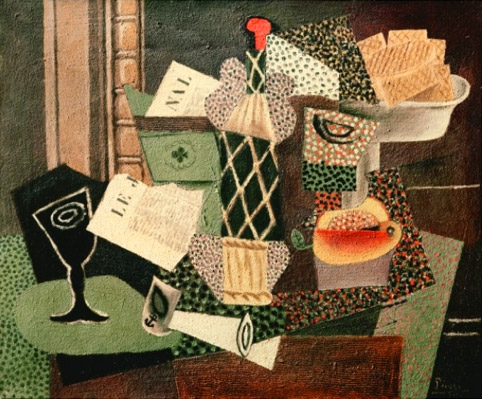
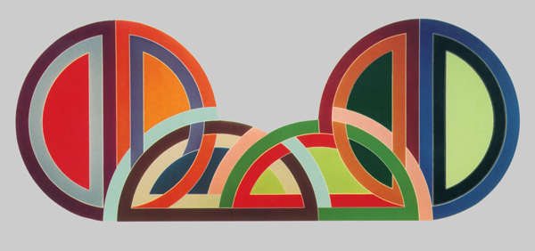
On the other hand, Picasso and Frank Stella use local color in these:

